(Very) Complex Graphs form (Very) Simple Ideas
Table of Contents
1. Introduction
In this chapter we will explore how very simple ideas and lots of computations lead to astonishingly intricate graphs. There are no exercises this time, but you should study the graphs carefully. Except for the first example we will use recursion again, but this time to make graphs.
2. You always thought you understood multiplication
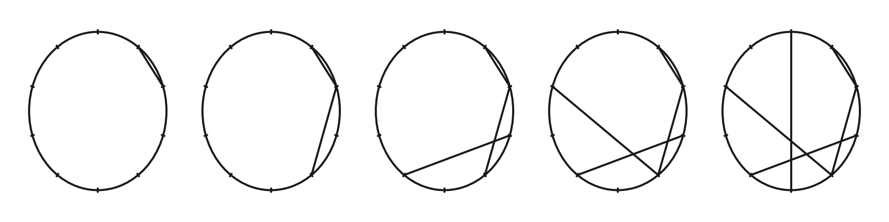
We all know that \(2\times 3 = 6\), and that \(2\times 8 = 16\). We also know that \(2\times 3 \bmod 10 = 6\) and \(2 \times 8 \bmod 10 = 6\). As a variation on this theme, let's lay out the numbers \(0, 1, \ldots, 9\) on a circle at equally spaced intervals, like the hours on a clock, and draw lines between points that relate through multiplication by \(2\) modulo 10. Thus, we draw a line from \(1\) to \(2\), from \(2\) to \(4\), from \(3\) to \(6\), and so on. Realize that \(2 \times 9 \bmod 10 = 18 \bmod 10 = 8\), so from \(9\) we draw a line to \(8\). In more formal terms, we place the remainders \((2a) \bmod b\) on the circle where \(2\) is the multiplier, \(2a\) the divident, and \(b\) the divisor.
To actually draw the line from \(1\) to \(2\), we need a bit of geometry. The unit circle can be cut into \(10\) pieces of equal length by using an angle \(\phi= 2\pi/10\). Then, by setting
\begin{align*} x(n) &= \sin \phi n, & y(n) &= \cos \phi n, \end{align*}we find that \((x(0), y(0)) = (0, 1)\), \((x(1), y(1)) = (\sin \phi, \cos \phi)\), \ldots. It's best to show how all this works by means of a figure, so we need to set up that first.
In the left most circle of the next figure, we draw a line from \(1\) to \(2\). In the second cicle we add the line that corresponds to multiplying \(2\) by \(2\), in the third \(3\times 2\). In the last we see that \(5\times 2\bmod 10 = 0\). If we would continue, we would obtain a line from \(6\) to \(2\), and continuing until \(9\) we obtain a line from \(9\) to \(8\), as explained above. Then we are full circle, and the lines will start to overlap with previously drawn lines.
Here is the code to make the figure below. (If you want to code along, load the standard modules first.)
fig, axes = plt.subplots(nrows=1, ncols=5, figsize=(6, 1.5))
divisor = 10
phi = 2 * np.pi / divisor
multiplier = 2
for i, ax in enumerate(axes):
    ax.set_xticks([])
    ax.set_yticks([])
    ax.add_patch(Circle((0.0, 0.0), 1, ec='k', fc='none'))
    ax.set_frame_on(False)
    r1, r2 = 0.98, 1.02
    for j in range(10): # put the ticks on the circle
        x, y = np.sin(j * phi), np.cos(j * phi)
        ax.plot([r1 * x, r2 * x], [r1 * y, r2 * y], color="k", lw=1)
    for j in range(i + 2): # draw the lines
        x = [np.sin(j * phi), np.sin(j * multiplier * phi)]
        y = [np.cos(j * phi), np.cos(j * multiplier * phi)]
        ax.plot(x, y, color="k", lw=1)
fig.tight_layout()
# fig.savefig("../figures/circle-multiply.pdf")
fig.savefig("../images/circle-multiply.png", dpi=300)
Figure for above code.
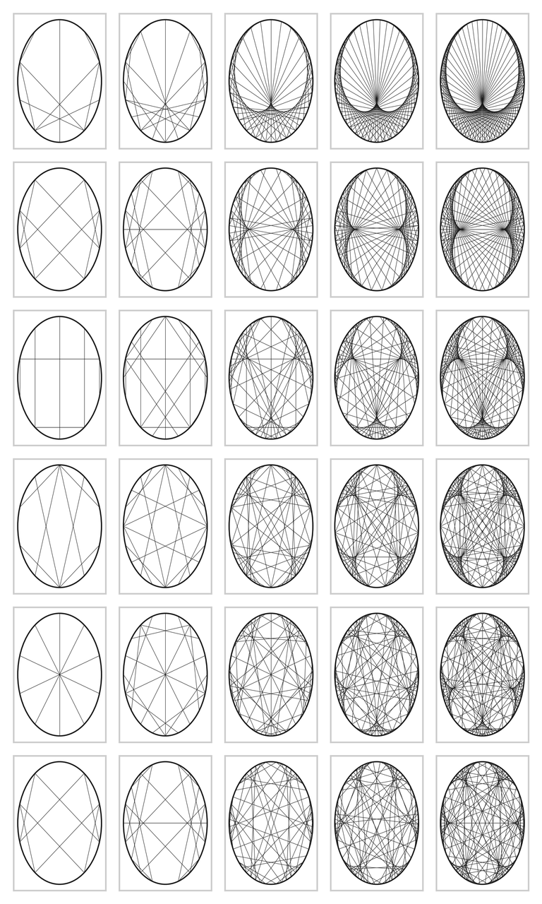
All this seems pretty dull and simple. However, the figures on the next page show what happens if we stick to using 2 as the multiplier but vary the divisor over the numbers \(10\), \(20\), \(50\), \(75\), \(100\). We made the graphs with the next pieces of code. The next function plots the lines from a point \(x\) on the circle boundary to \(2x\), as shown in the figure above, for all points equally spaced on the circle boundary with distance \(2\pi/n\), where \(n\) is the divisor.
def draw_lines(multiplier, divisor, ax, lw=0.1, ls="-"):
    phi = 2 * np.pi / divisor
    for i in range(1, divisor):
        x = [np.sin(i * phi), np.sin(i * multiplier * phi)]
        y = [np.cos(i * phi), np.cos(i * multiplier * phi)]
        ax.plot(x, y, color="k", ls=ls, lw=lw)
This is the loop to plot the circles with the lines corresponding to multiplication with \(2, 3, \ldots, 7\). The next set of figures contains the result; I admit that I was astonished by this result.
fig, axes = plt.subplots(nrows=6, ncols=5, figsize=(6, 10))

for i, multiplier in enumerate([2, 3, 4, 5, 6, 7]):
    for j, modulo in enumerate([10, 20, 50, 75, 100]):
        axes[i, j].set_xticks([])
        axes[i, j].set_yticks([])
        draw_lines(multiplier, modulo, axes[i, j], lw=0.3)
        axes[i, j].add_patch(Circle((0.0, 0.0), 1, ec='k', fc='none'))

fig.tight_layout()
fig.savefig(f"../images/circle-tables.png", dpi=300)
# fig.savefig(f"../figures/circle-tables.pdf")
Figure for the code above.
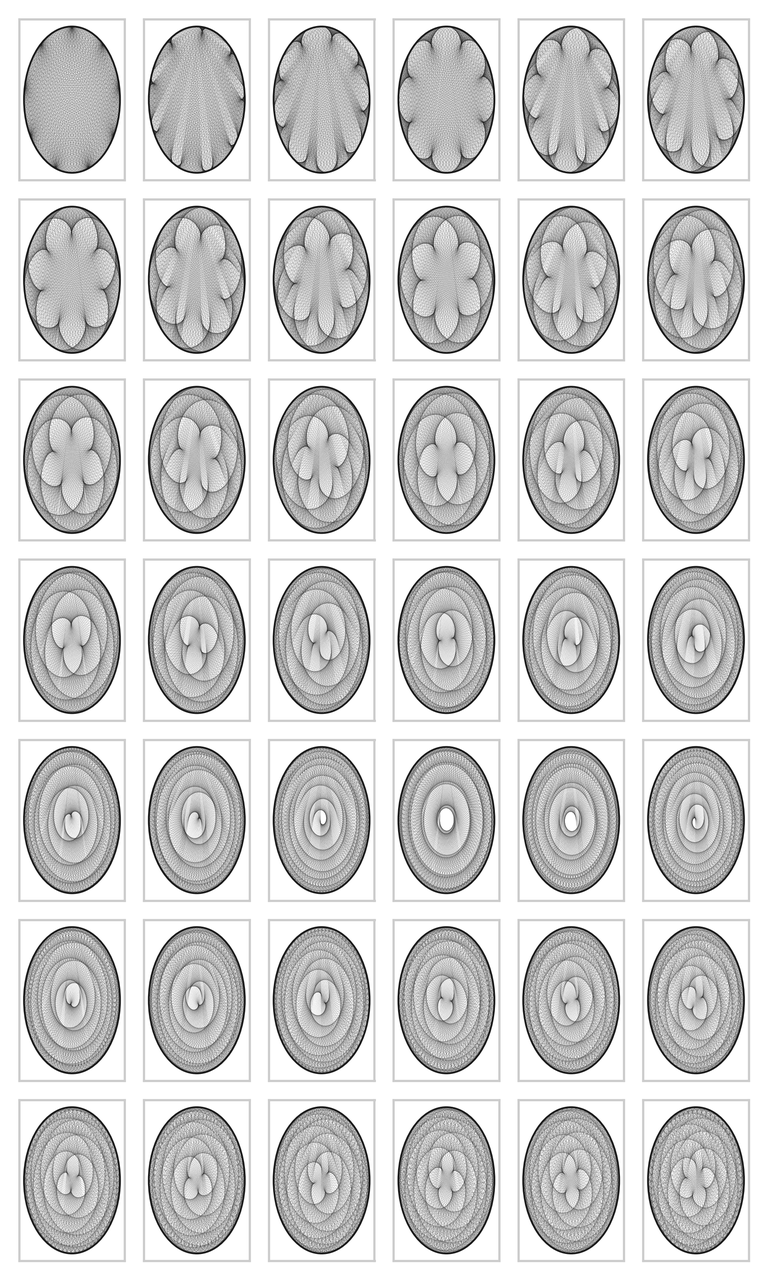
But this is not the end of matter. The graph can become much more interesting. We can fix the modulo to \(200\), and vary the multiplier from \(2\) to \(7\) in small steps. The code below contains yet some further variations. The results are amazing in my opinion; I did not know that simple multiplication could lead to such beautiful graphs. If you run the code on your screen you can see yet more detail. The graphs are wonderfully complex: reading from left to right, we can see that the cusps are `woven into the graphs', and the larger the divisor, the more cusps.
def vary_multiplier(fr, to, modulo, ls="-", lw=0.1):
    fig, axes = plt.subplots(nrows=7, ncols=6, figsize=(6, 10))
    axes = axes.flatten()

    for i, multiplier in enumerate(np.linspace(fr, to, len(axes))):
        axes[i].set_xticks([])
        axes[i].set_yticks([])
        draw_lines(multiplier, modulo, axes[i], lw=lw, ls=ls)
        axes[i].add_patch(Circle((0.0, 0.0), 1, ec='k', fc='none'))

    fig.tight_layout()
    fig.savefig(f"../images/circle-modulo-{modulo}-{fr}-{to}.png", dpi=300)
    # fig.savefig(f"circle-modulo-{modulo}-{fr}-{to}.pdf")

vary_multiplier(2, 7, 200)
vary_multiplier(22, 23, 200)
vary_multiplier(50, 52, 200)
vary_multiplier(380, 381.5, 855, ls=":")
Figure for case 2, 7, 200
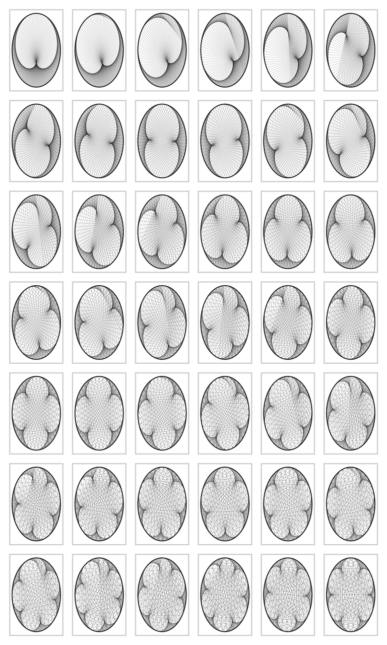
Figure for case 22, 23, 200
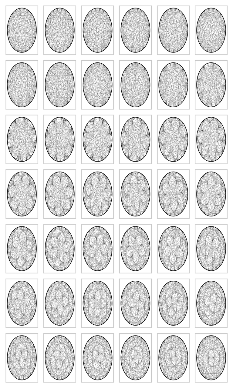
Figure for case 50, 52, 200
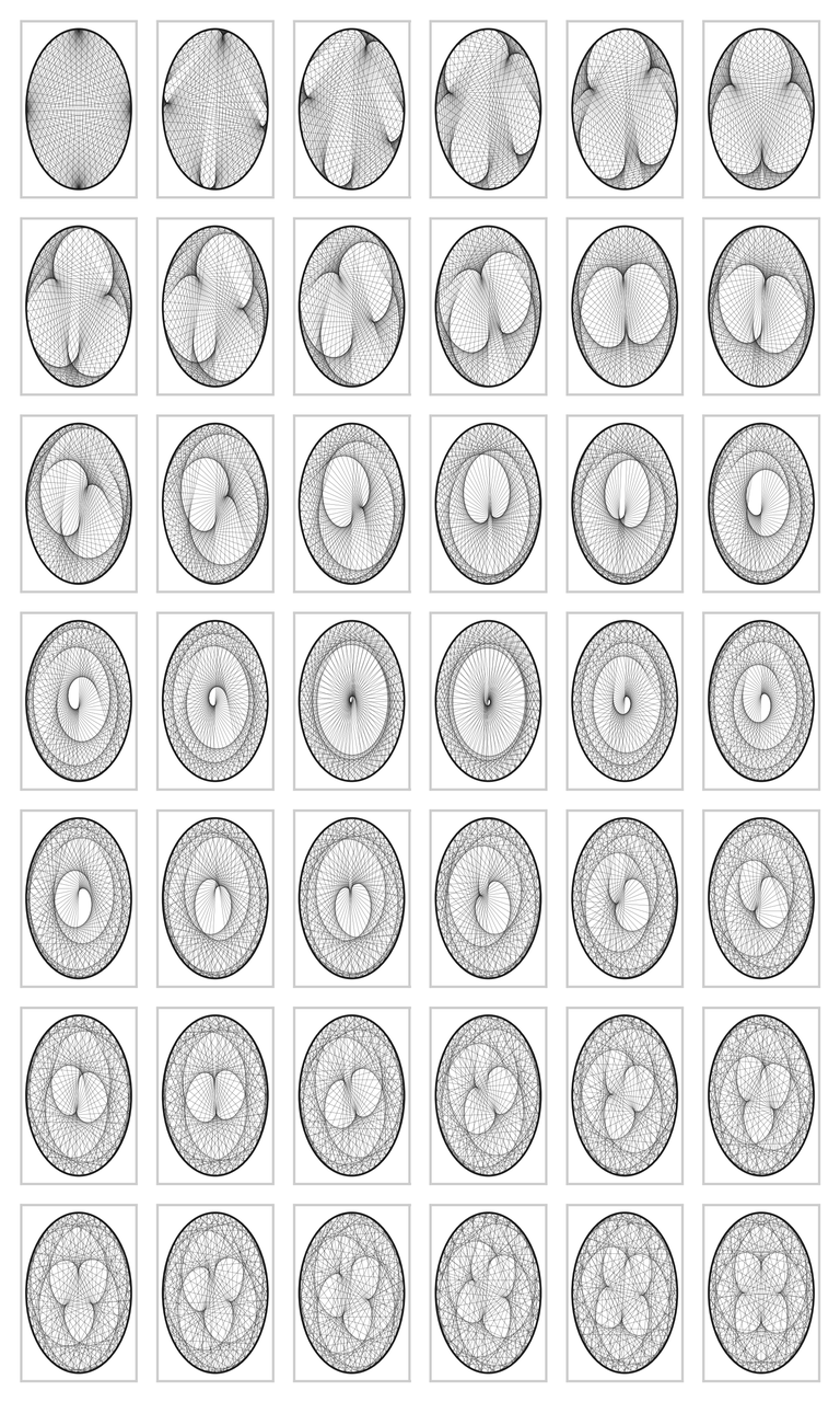
Figure for case 380, 381.5, 800
The figures can be turned into a movie with the next code.
import os
import numpy as np
import matplotlib.pyplot as plt
import imageio.v2 as imageio


divisor = 855
filenames = []

for multiplier in np.linspace(380, 381.5, 300):
    print(multiplier)
    fig, ax = plt.subplots(nrows=1, ncols=1, figsize=(10, 10))
    draw_lines(multiplier, divisor, ax)
    ax.set_title(f"{multiplier}")
    filename = f"frame_{multiplier:.4f}.png"
    fig.savefig(filename)
    plt.close(fig)
    filenames.append(filename)

with imageio.get_writer('circle_movie.gif', mode='I') as writer:
    for filename in filenames:
        image = imageio.imread(filename)
        writer.append_data(image)

# remove the temporary files
for filename in filenames:
    os.remove(filename)
3. You always thought you understood division
Draw an equilateral triangle on a unit circle with its tip on \(z_{3} = x(0,1)\), and \(z_1\) and \(z_2\) as the two corners at the base. Start a walk at \(x_{0}\) somewhere in the triangle, and throw a die. Suppose the outcome lies in \(1, 2\), then select point corner \(1\) and plot a point half way \(x_0\) and \(z_1\), i.e., at \(x_1 = (x_{0}+z_{1})/2\). If the outcome lies in \(3, 4\), draw \(x_1\) halfway between \(x_0\) and \(z_2\), and otherwise between \(x_0\) and \(z_3\). Throw the die again to select one of the three corners, and draw \(x_2\) halfway \(x_1\) and the seleced corner. Keep on repeating this until bored, and then ask the computer to take over to generate an enormous sequence of points \(\{X_k\}\).
First we make the three corners of the equilateral triangle with its tip on \((0,1)\).
import numpy as np
import gnuplotlib as gp

n_angles = 3 # make the triangle
Z = np.zeros((n_angles, 2))
for j in range(n_angles):
    Z[j, 0] = np.sin(j * 2 * np.pi / n_angles)
    Z[j, 1] = np.cos(j * 2 * np.pi / n_angles)
Next, we make the iterated sef of points half way a uniformly selected corner and the current point.
num = 50000

X = np.zeros((num, 2))
U = np.random.randint(0, n_angles, size=num)

X[0] = Z[2]
for j in range(1, num):
    X[j] = (X[j - 1] + Z[U[j]]) / 2
It remains to plot the points.
In the code below I use gnuplot, rather than matplotlib, because gnuplot works faster with many points and it's also better at plotting many single points.
The pointsize can be tuned with ps 0.1, and the point type by pt.1
gp.plot(
    (X[:2000, 0], X[:2000, 1]),
    (X[:5000, 0], X[:5000, 1]),
    (X[:50000, 0], X[:50000, 1]),
    _with="points pt 0 lc 'black'",
    unset=['xtics', 'ytics'],
    xlabel="",
    title="",
    multiplot='layout 1,3',
    hardcopy='../images/sierpinsky.png',
)
Figure of the Sierpinksy triangle.

What works for a triangle might also work for a hexagonal. For \(j=0, 1, \ldots, 5)\), take \(z_j = (\cos (2\pi j/ 6), \sin(2\pi j/6))\), so that \(z_j\) corresponds to the \(j\) th corner of a hexagon. A bit of experimentation shows that the update rule \((x_k + z_{i})/3\), i.e., dividing by \(3\) instead of \(2\), gives nice results. For the rest, the code is the same as above.
Figure of the hexagonal triangle.

These are suprising results, aren't they? The first example is known as Sierpinsky's triangle, and, interestingly, there exists a direct relation with Pascal's triangle. For further background and explanations, you should consult the book `Chaos and Fractals' by H.O.Peitgen, H.Jürgens and D.Saupe.
4. You always thought you understood stability in 1D
Time series appear to be relatively simple objects: let \(X_{k+1} = a X_{k} + U_{k+1}\), with \(a \in (-1, 1)\) and \(U_{k}\sim\Unif{\{-1, 1\}}\). It may seems that this will lead to simple stochastic process: since \(|a|<1\), it stays in the neighborhood of \(0\), and that's it. To see whether this is indeed true, let's apply this rule many, many times, first with \(a=0.8\), then with \(a=0.61\).
We make bins such that each bin contains \(1\%\) of the observed valued of \(\{X_k\}\).
It's easy to np.histogram, but there is one small detail: this function returns the (scaled) number of observations per bin as hist, and the boundaries of the bins as bins.
Now there is one more boundary than bins, that is, to make one bin, we need two `walls', to make two bins, we need three `walls'.
Thus, to plot the points, we remove the left most boundary, so that we have just as many values for the $xS coordinate as for the \(y\) coordinate.
Here is the code.
def simulate(a):
    num = 2000000
    X = np.zeros(num)
    U = 2 * np.random.randint(2, size=num) - 1

    for j in range(1, num):
        X[j] = a * X[j - 1] + U[j]

    n_bins = int(num / 100)
    hist, bins = np.histogram(X, bins=n_bins, density=True)
    X = np.zeros((n_bins, 2))
    X[:, 0] = bins[1:]
    X[:, 1] = hist
    return X


X1 = simulate(a=0.8)
X2 = simulate(a=0.61)

gp.plot(
    (X1[:, 0], X1[:, 1]),
    (X2[:, 0], X2[:, 1]),
    _with="points pt 0 lc 'black'",
    unset=['xtics', 'ytics'],
    xlabel="",
    title="",
    multiplot='layout 1,2',
    hardcopy=f"../images/time_series.png",
)
These are the densities of the time series, the left is for \(a=0.8\), the rigth for \(a=0.61\). Perhaps a bit unexpected, but the densities turn out to be very complicated objects. If you're interested in a more profound mathematical analysis, consult Promenade Aleatoire by M.Benaim and N.El Karoui.
Figure of the density for time series.

5. You always thought you understood stability in 2D
This final example is just a straightforward generalization of the above time series, but now in 2D. (This is again one these ideas that are straightforward once you see it, but they are often hard to invent.) We have two matrices \(A_0\) and \(A_1\), and two vectors \(B_0\) and \(B_1\). Then, let
\begin{align*} X_{k+1} = A_{U_{k+1}} X_k + B_{U_{k+1}}, \end{align*}where \(U_k \sim \Unif{\{0, 1\}}\).
In the code below we call the numba package to speed up the computation; it saves about a factor \(10\) while it costs us nothing except loading the package, and typing @jit on top of a function.
import numpy as np
from numba import jit
import gnuplotlib as gp


A = np.zeros([2, 2, 2])
A[0] = np.array([[0.839, -0.303], [0.383, 0.924]])
A[1] = np.array([[-0.161, -0.136], [0.138, -0.182]])

B = np.zeros([2, 1, 2])
B[0] = np.array([0.232, -0.080]).reshape(2)
B[1] = np.array([0.921, 0.178]).reshape(2)


num = 500 * 1000

gen = np.random.default_rng(3)
U = gen.binomial(1, 0.2, size=num)

X = np.zeros((num, 2))


@jit(nopython=True)
def do_run(X):
    for j in range(1, num):
        X[j, :] = A[U[j]] @ X[j - 1, :] + B[U[j]]


do_run(X)


gp.plot(
    (X[:, 0], X[:, 1], dict(_with="points pt 7 ps 0.02 lc 'black'")),
    xlabel="",
    title="",
    hardcopy="../images/spiral.png",
)
This is the spectacular result. By the way, you might try to make the same result with matplotlib, but I am underwhelmed about its performance on making such plots.
Figure of the spiral.

Footnotes:
Gnuplot is a great plotting tool. It loads super fast and deals easily with a million points.